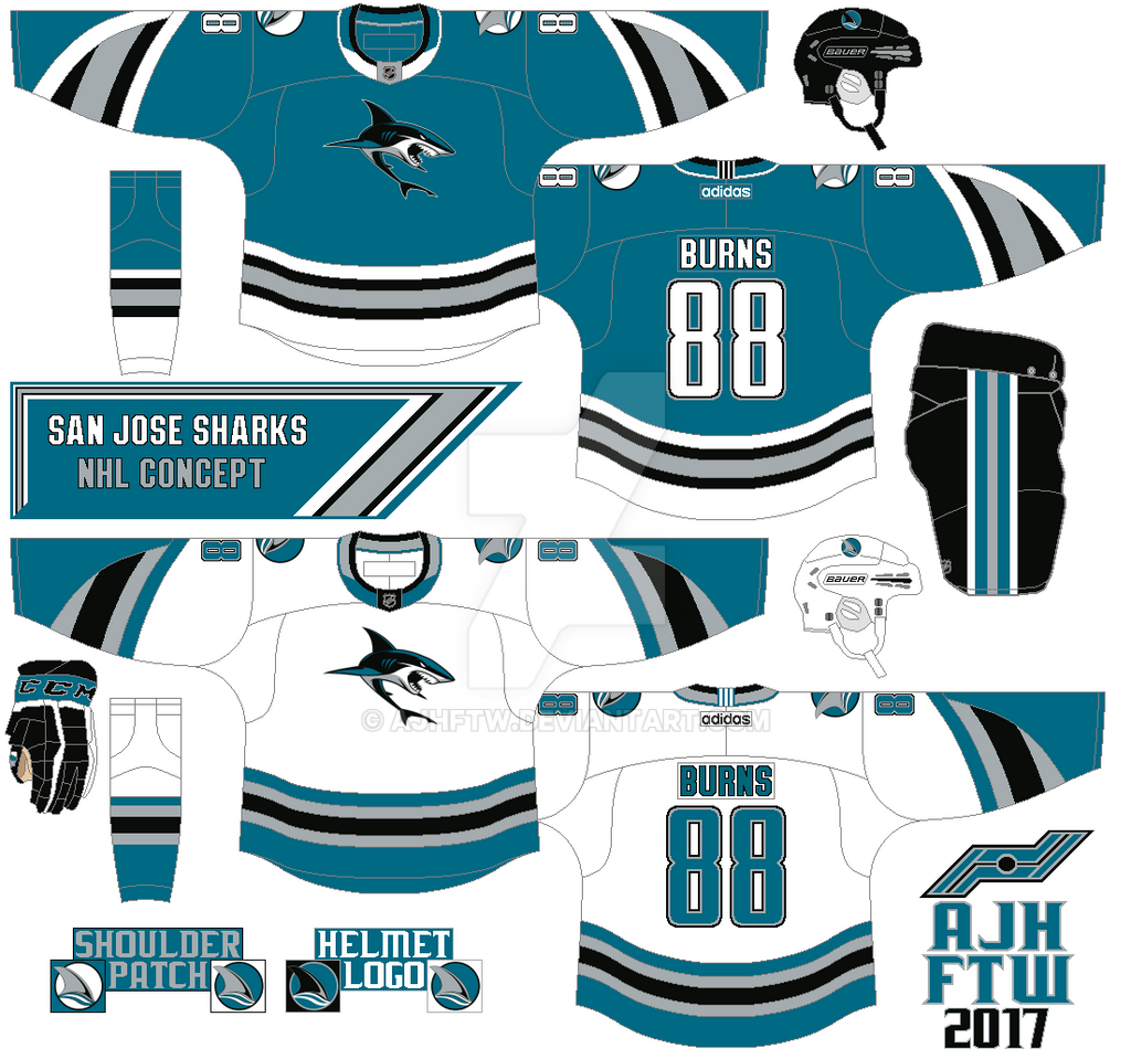
Taking one of Reebok's cookie cutter template arm stripe, put some stripes inside of it. The main logo is the team’s no stick shark secondary logo followed by the team’s old shark fin logo for the shoulders. Standard block for the nameplate, and SJ’s old font (1998-2007) for the numbers.
To be fair & honest, lemme be the first to say that I like the 98-07 Sharks number font. I just wished that it wouldn't disappear, especially since the RBK Edge template era began with their rebranding by changing silver to burnt orange, which I wouldn't mind. But that font should had stayed for those upcoming rebrands.
ReplyDeleteBack to your concept, lemme just say that the sleeve designs look very cool to begin with, in a very sleek manner; as well as the hem. Great job on designing it.