Hi everyone Alan here
for a rant, and a concept in one post, today it’s the Atlanta Thrashers.
5 years ago on this
day the club was sold to True North Sports & Entertainment and move to
Winnipeg to become the Jets. Even thou I’m happy the Winnipeg got an NHL team
back but at the same time I was bitter about it because around the same time as
Thrashers had ownership problems but also the Phoenix Coyotes (now Arizona) had
it much worse then what the Thrashers had, I mean the Thrashers had better
chance of getting a better owners then the Coyotes and they share the same
arena with other sport club (NBA’s Atlanta Hawks) for crying out loud but sadly
the NHL choose the Coyotes over the Thrashers. After 12 years of this team’s
time in the NHL with only 1 division title in 2006-07 season not only bad
rosters, bad managements, bad fans supports was their downfall, but also their
jerseys would take a downfall as well. Let’s take a look at the jerseys
timeline, with my thoughts about the jerseys. All images are from NHLUniforms
Database.
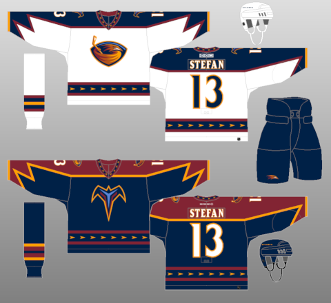
1999-2003: The team’s
first set was right off the bat my favorite set! Arrows on the hem, and on the
collar was unique, and the arms was different and fits the team. Lastly the
logos both the bird and the “T” logo are equally good. I own a dark jersey and
enjoy that jersey.
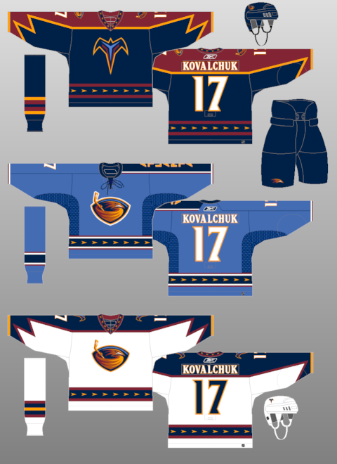
2003-2006: In 2003
the team presented us an over the top alternate jersey that totally threw
concept minds out the window! For me it was so Atlanta Thrashers with the word
“ATLANTA” vertically down on the left sleeve it can’t go any more far then
that. Of course I own the alternate jersey and I like it, it’s one those
jerseys that should remain to be just an alternate.
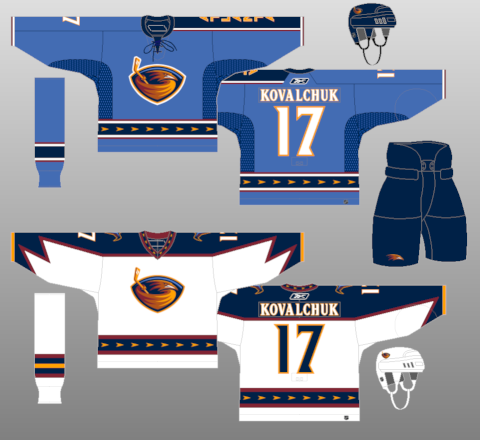
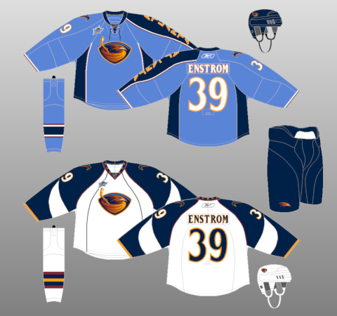
2006-07: Sadly the asymmetrical
alternate jersey becomes the team's new home jersey, replacing the team’s first
dark jersey was a bad move in my mind because it was their identity and the
asymmetrical jersey should remain to be an alternate.
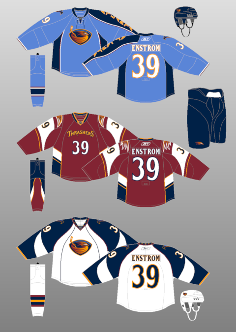
2007-08: It’s bad
enough that the asymmetrical jersey carried over to Reebok Edge system but they
got rid of the arrow hem stripe and replace it with vertical side penal on the
side the jersey, it’s O.K. but without the arrow stripes it’s not my cup of tea.
Even thou on the white jersey has the arrows on collar but replacing the arrows
hem with vertical piping it’s a no, no for me.
2008-11: In 2008 the
Thrashers present their alternate jersey that pretty much a football theme
jersey, got the wordmark arched with front numbers, a bird head logo on the
shoulders, and a terrible sock design. The jersey could be an alright alternate
jersey but it would be better if it was navy blue instead of maroon.
So my top 6 Atlanta
Thrashers Jerseys (images from sportslogos.net)
 |
| 6. 2008 alternate jersey |
 |
| 5. 2007 white jersey |
 |
| 4.2007 light blue jersey |
 |
| 3. 2003 light blue alternate jersey |
 |
| 2. 1999 white jersey |
 |
| 1. 1999 navy blue jersey |
Now with that out of the way today I got myself a concept. Well make that 2, one is an entry to the HJC contest, the other with some stripes fix.

This concept is base on my previous Thrashers concept, but making the bird logo as the main logo on both jerseys while the "T" logo stays on the shoulders and on the helmets.

Same as the other set but fix the stripes on the arms, hem, and on the pants.
Well that's today post. I got one more but that'll be posted until after the Stanley Cup Finals, it'll be a rant and a requested concepts in one. Til then, later.
No comments:
Post a Comment